Black Spruce Financial Rebranding
Black Spruce principal Gino Scialdone was looking for a more impactful way to communicate his unique value proposition. Our brand strategy partner, Coin, was engaged to facilitate a brand foundation that would get to the essence of this positioning, and also to the core of why Gino chose his career – which is the thing that customers actually care about most.
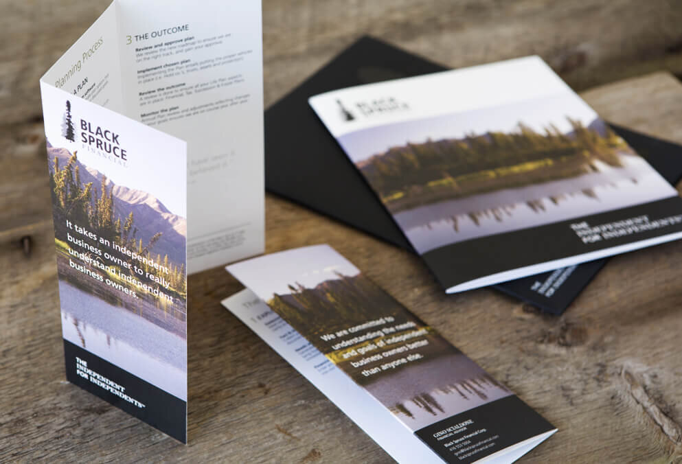
Gino’s why manifested in his brand mission: We are committed to understanding the needs and goals of independent business owners better than anyone else. This presented an analogy with the black spruce tree: wherever it grows, it stands out tallest among the trees immediately around it.
This insight led us to develop a hand-drawn icon as part of the logo design in which a black spruce is the most prominent tree – a subtle yet permanent reminder to Gino and his clients of his crucial mission.
Other design elements included a website, letterhead, business card, tri-fold brochure, booklet and mailing labels. For the large tree on the folder and business cards, black foil is presented on a black background, to convey sophistication and exclusivity – perfect for the Black Spruce target market of high net worth business owners.